Whether you’re printing with CMYK or Pantone colors, consistency is essential to reinforce your brand’s identity. Color matching across manufacturers is challenging, especially when today’s fast-paced consumer-driven market demands immediate product placement.
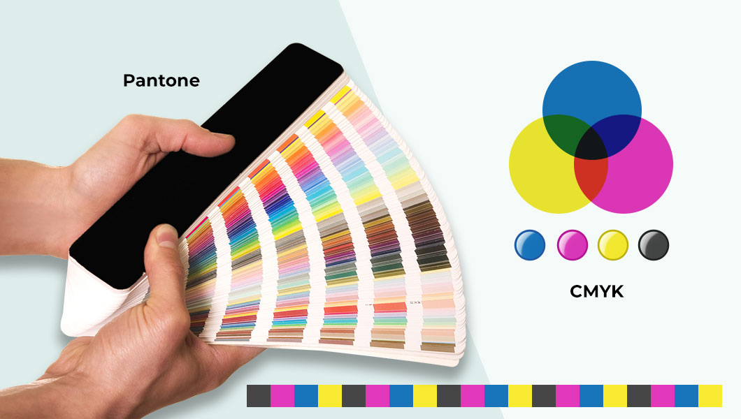
The two major color systems used today are CMYK colors and Pantone colors. Ensure consistent branding by understanding the key differences between these two robust color systems.
Ensure effective branding by using a consistent color system across the board. Your marketing material and product packaging must utilize the right approach to get the most from it.
This example expresses the importance of color matching. The best example is your brand’s logo since it is printed on almost everything. If you design the logo using Pantone colors and try printing it on a CMYK press, you’ll end up with inconsistent colors since CMYK printing can’t replicate all Pantone colors. So you need to understand how these two popular color systems work.
Printing with CMYK Colors
CMYK is an acronym that represents the colors used to define the process. It uses process color printing with cyan, magenta, yellow, and black to produce the result. This scheme is found in a wide range of inkjet printers. It’s the best choice for brands looking to build hyperrealism in their designs.
One of the most important concepts when dealing with CMYK is that presses use a process known as screening to produce vivid colors. Using a sophisticated halftoning method, CMYK can transform one color to another since it changes how the human eye perceives the color. The entire CMYK process is dependent on halftoning. Without it, only a total of seven colors could be produced.
Printing with Pantone Colors

Pantone colors have turned the marketing world on its head. Its unique style boasts over 1,800 colors and ensures that all departments within an organization can match the exact color even if they never come into direct contact. As a result, color inconsistencies are no longer an issue when transferring designs to printers and digital media.
We see Pantone colors used in industries where consistency and accuracy are paramount. The sector primarily includes fashion, real estate, and beauty, but other industries have also hopped on board with this accurate color system.
All colors are matched using a unique code that is easily transferrable from one entity to another. Thus, eliminating any possibility of miscommunication.
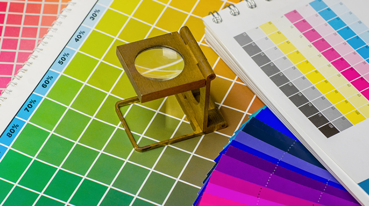
The Difference – Pantone vs. CMYK Printing
Let’s cut right to the chase. Due to its unique color coding system, Pantone is much more accurate and consistent. As long as the correct code gets communicated, the colors produced across manufacturers will be identical. So why would an organization even consider CMYK if Pantone is so accurate?
Well, Pantone does have its downsides. Pantone colors are used in spot color printing, which requires printers to be prepped for each print job, and this is time-consuming.
Pantone should be reserved for large print jobs. CMYK is much more cost-efficient with smaller batches of print jobs.
Another significant difference is that Pantone is not compatible with RGB color schemes, so you will have a tough time with PMS printing if your designs use RGB.
Printing with CMYK colors provides more versatility since many Pantone colors are unreplicable on certain CMYK printers.
Recent Advancements in Printing with Pantone & CMYK Colors
New print devices have powerful digital printing capabilities, including metallic enhancements. This configuration is a growing trend that makes CMYK a beneficial choice.
To capitalize on powerful CMYK print capabilities, Pantone launched a new CMYK-coated and uncoated guide in 2021. These guides work with G7 calibrated printers and offer over 1,800 coated colors and over 1,600 uncoated colors that don’t match existing Pantone formulas.
At the beginning of 2022, Pantone also released a stunning new color innovation called Pantone Skintone Validated. This innovation allows specific devices to produce skin tones, according to the Pantone SkinTone Guide.
Finally, Xerox released a new line of highly advanced printers designed to overcome the challenges associated with CMYK colors.
Conclusion
Businesses understand the importance of consistent branding when printing with CMYK or Pantone colors. But that consistency must not sacrifice the quality of designs, so your organization must incorporate these two power color systems into your plans. To do that, you need an expert designer who understands them in detail.
Prepress Pro’s color management services have CMYK and Pantone color systems experts. This process ensures consistent branding at an affordable price. Contact us to learn more.
Prepress Pro is a leading provider of high-quality Digital Prepress Services specializing in pre-press of essential marketing and sales material like advertisements, print pieces, billboards, publications, trade shows, and packaging.